
Big Thank You & Apologies to James Kochalka!
As James Kochalka’s daily diary comic American Elf ended on 2012/12/31 after 14 years and at least 5106 strips. I wondered about its visual evolution.
First, let’s look at its shape’s consistency. The comic/page comes in a near square format and usually consists of a heading, 4 square panels, and the date. Sometimes it’s just 3 or 2 panels, one big panel, a list or… something. The early strips were black and white. This is what an average (literally) strip looks like:

I used a fairly simple technique which I once thought I had invented, while it’s pretty much as old as photography – it’s basically a multiple exposure (of stuff that looks alike). Here’s a nice example (hover over the names on the bottom right).
The 4-panels-structure dominates, then there’s the headline at the top, the date at the bottom (where you can even see the space between month/day and year). While the colors cancel each other out (it’s not the early strips that cause the grayness), you can see a light skew: the left border isn’t really straight.
Let’s look at this through time:

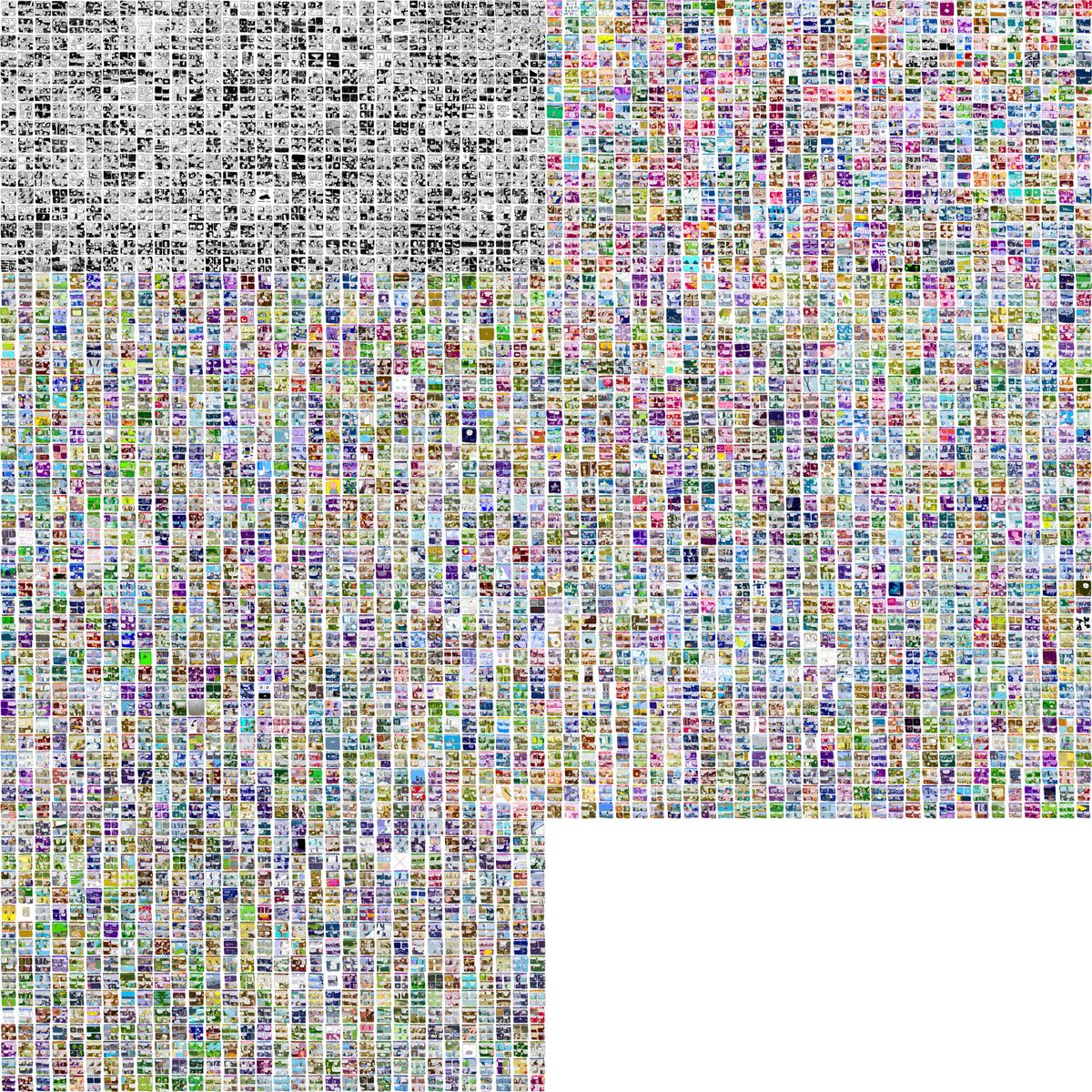
Here, each image contains one fourth of the strips, i.e. the first 1200+ strips or 3 years in the top left corner, and so on, left-to-right, top-to-bottom.
It’s apparent now that the first years were black and white, and had no heading. The early color strips tended to pink/red/purple tones, and headlines seem to be yellow predominantly.
Again, but with more granularity/temporal resolution:
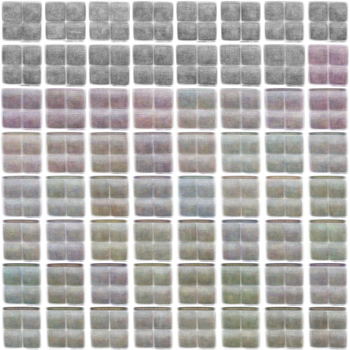
Here, each sample contains roughly 80 images – so it’s like favorite color of the season, i guess.
Now let’s look at all strips individually:
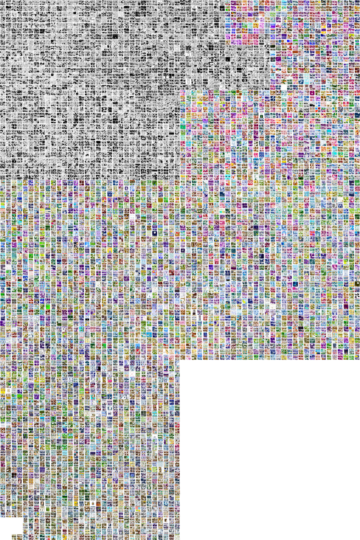
The strips are laid out following a hilbert curve. Other than a left-to-right-top-to-bottom text-like layout (with line-breaks), it preserves locality: a month is not a line, but a block. That’s why all the early strips sit in the upper left corner, and are followed by the bright colored in the upper right corner. The curve then turns to the bottom, to the left, and down again, before it ends in the bottom left corner (hilbert curves only come in specific “capacities”, and the 5106 strips fit uncomfortably between 4096 and 16384).
Conclusion?
When I look at this data visualization I feel a little, well, uneasy. It’s a cold analysis of a work of art full of heart and warmth. It compresses over 5000 days of work into on neat graphic. Plus, I made a machine crawl your website and download all those handcrafted images…
But that’s just one way to look at it – I hope it rather is an awe-inspiring celebration of a masterpiece (these are heavy words), made with handcrafted scripts. And (image)magic(k).
So, again: Thank You & Sincere Apologies, James Kochalka!