
a term soon to pop up in florid old media articles about unexpected kickstarter success stories
data-visualizing American Elf
Big Thank You & Apologies to James Kochalka!
As James Kochalka’s daily diary comic American Elf ended on 2012/12/31 after 14 years and at least 5106 strips. I wondered about its visual evolution.
First, let’s look at its shape’s consistency. The comic/page comes in a near square format and usually consists of a heading, 4 square panels, and the date. Sometimes it’s just 3 or 2 panels, one big panel, a list or… something. The early strips were black and white. This is what an average (literally) strip looks like:
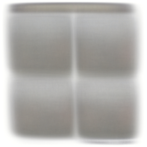
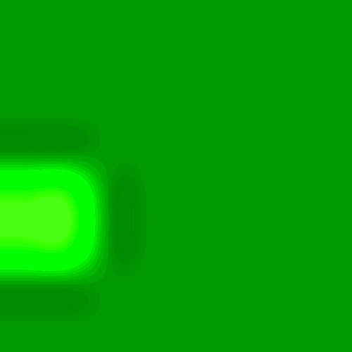
I used a fairly simple technique which I once thought I had invented, while it’s pretty much as old as photography – it’s basically a multiple exposure (of stuff that looks alike). Here’s a nice example (hover over the names on the bottom right).
The 4-panels-structure dominates, then there’s the headline at the top, the date at the bottom (where you can even see the space between month/day and year). While the colors cancel each other out (it’s not the early strips that cause the grayness), you can see a light skew: the left border isn’t really straight.
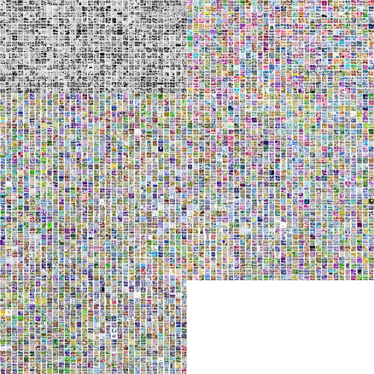
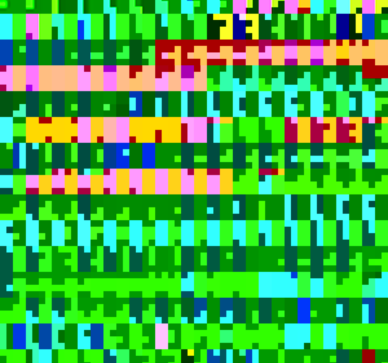
Let’s look at this through time:

Here, each image contains one fourth of the strips, i.e. the first 1200+ strips or 3 years in the top left corner, and so on, left-to-right, top-to-bottom.
It’s apparent now that the first years were black and white, and had no heading. The early color strips tended to pink/red/purple tones, and headlines seem to be yellow predominantly.
Again, but with more granularity/temporal resolution:
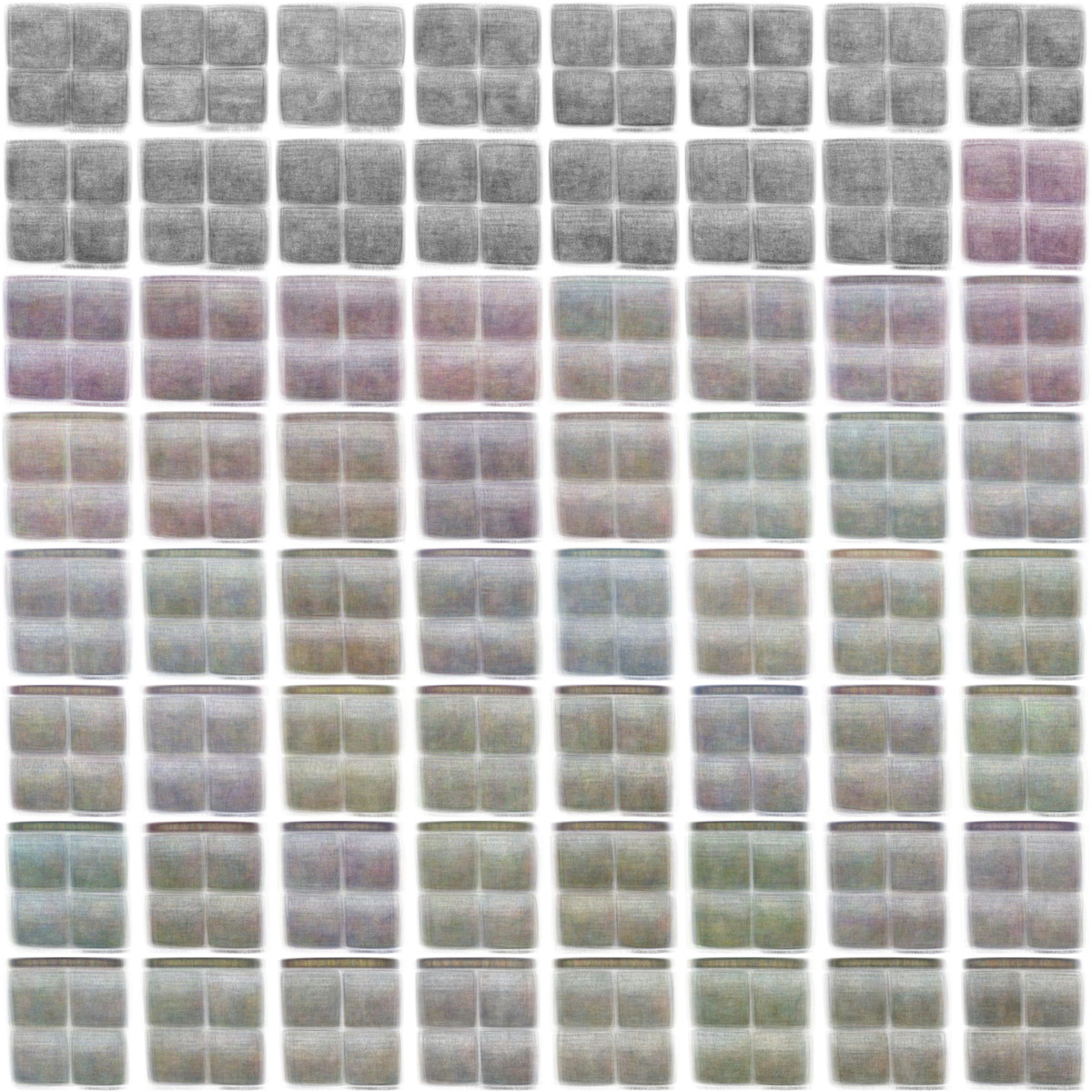
Here, each sample contains roughly 80 images – so it’s like favorite color of the season, i guess.
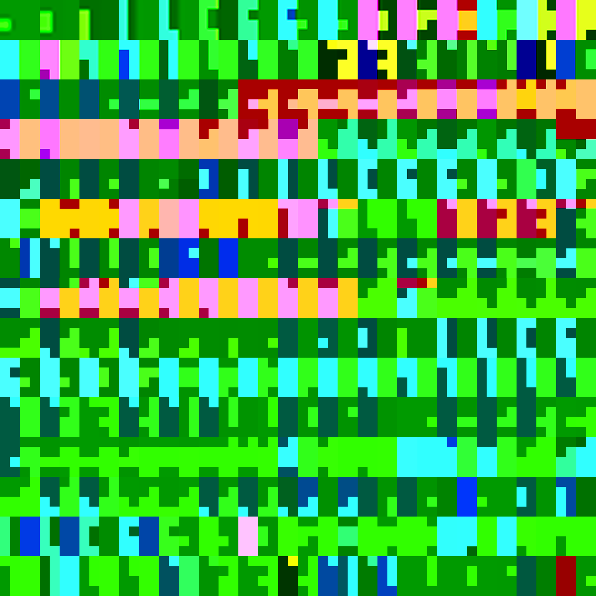
Now let’s look at all strips individually:
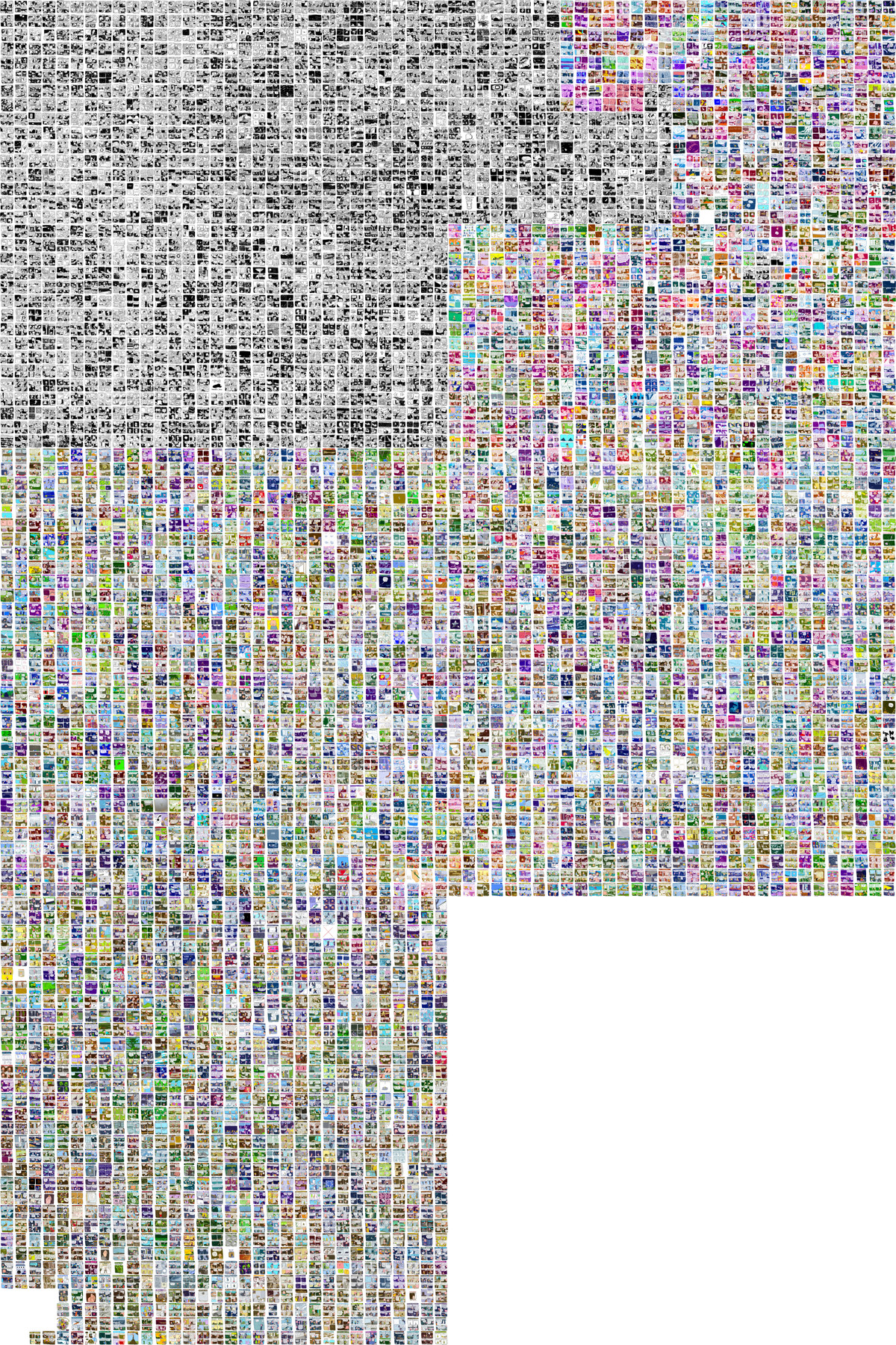
The strips are laid out following a hilbert curve. Other than a left-to-right-top-to-bottom text-like layout (with line-breaks), it preserves locality: a month is not a line, but a block. That’s why all the early strips sit in the upper left corner, and are followed by the bright colored in the upper right corner. The curve then turns to the bottom, to the left, and down again, before it ends in the bottom left corner (hilbert curves only come in specific “capacities”, and the 5106 strips fit uncomfortably between 4096 and 16384).
Conclusion?
When I look at this data visualization I feel a little, well, uneasy. It’s a cold analysis of a work of art full of heart and warmth. It compresses over 5000 days of work into on neat graphic. Plus, I made a machine crawl your website and download all those handcrafted images…
But that’s just one way to look at it – I hope it rather is an awe-inspiring celebration of a masterpiece (these are heavy words), made with handcrafted scripts. And (image)magic(k).
So, again: Thank You & Sincere Apologies, James Kochalka!
l2g w3s
here’s some handy abbrvs. for Peter Norvig’s (via nerdcore) “24 words with length of 20 or more (that are mentioned at least 100,000 times each in the [google books] corpus)”:
electroencephalographic → e21c
polytetrafluoroethylene → p21e
 forschungsgemeinschaft → f20t
 deinstitutionalization → d20n
 counterrevolutionaries → c20s
 dehydroepiandrosterone → d20e
 electroencephalography → e20y
  immunoelectrophoresis → i19s
   institutionalisation → i18n
   acetylcholinesterase → a18e
   internationalization → i18n
   institutionalization → i18n
   radiopharmaceuticals → r18s
   electroencephalogram → e18m
   keratoconjunctivitis → k18s
   counterrevolutionary → c18y
   immunohistochemistry → i18y
   internationalisation → i18n
   hypercholesterolemia → h18a
   phosphatidylinositol → p18l
   compartmentalization → c18n
   electrophysiological → e18l
   electrocardiographic → e18c
   uncharacteristically → u18y
btw these words are utterly useless for scrabble.
there is no pattern.
A friend asked me to help her make a video, which was supposed to look like this:
![]()
A white square, then one black pixel appears, then another adjoining one, another one; repeat with white pixels as soon as the square’s black. Randomize, goto 10. A simple algorithm, a quick PHP script that would output a series of tiny PNGs. But as soon as I tried to convert the dozens of 5×5px images to a movie (picking the lossless FFV1 codec as intermediate format), and scaling it up with a nearest-neighbor/point filter (up to DVD size), something weird happened: colors appeared from nowhere, even though I was explicitly converting to grayscale.
I ran some more scripts, and it turned out that the colors depend on the scale factor. Here’s an animated gif where every frame was converted with a different scale factor. (take a close look at the edges, they’re more blurred in the beginning, as the scale factor was higher. Ignore the GIF artifacts.
I wondered if there was a pattern, so I made a montage. The scale factor decreases left-ro-right, top-to-bottom.
I guess there is no pattern.
I tried other combinations of codecs, scale factors and colors, to no success. This “problem” turned out to be limited to
- really small files
- the nearest-neighbor/point filter
- the FFV1 codec
- an ancient version of MEncoder